How to take professional flat lay photos for Instagram
- Rachel Bath
- Jun 25, 2020
- 6 min read
Show off your products, your workspace, your brand ethos, even how you are feeling today, with a clean and stylish overhead photo on social media. We have been art directing this sort of photography for many years, while producing lifestyle magazines, and here are some tricks that we have picked up along the way...

1) Get organised
No matter how simple and small-scale these images seem, believe me, they take time to get right. Honestly, the number of hours we have spent fiddling with object placement... "Bit to the left Katie, no back a bit, no left a bit..." Creating a casual, stylish image, unfortunately, is never just a case of plonking stuff on a table and snapping away. So our first bit of advice is to clear a couple of hours out of your schedule, make sure you have everything you need and prepare a list of the images that you would like to take. This is what we call the shoot list. Honestly, it's essential. There's nothing worse than taking the set apart and realising you forgot something!


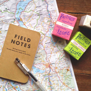
2) Create your set
When shooting an overhead image, we find it is best to place your objects on the floor and stand on a footstool to get enough height between us and the set. This prevents the image from distorting, helps to keep it looking flat and ensures we fit everything in.
To create a 'tabletop' we use large pieces of plywood, beech, oak and MDF, some of which we have white-washed. You can pick these up easily in any DIY store. Visit your local art shop too and invest in a set of A2 card sheets in colours that fit with your brand. You can also buy rolls of wallpaper and vinyl that have been printed with natural textures like marble, wood grain and metal. The one in the shot below is a wallpaper print from B&Q.
We also like to use fabric backdrops. Muslin and linen are beautifully elegant, whereas brightly printed or woven textiles can make a simple, plain object really sing. Just remember to iron all of the fabric before you start and practise draping and folding the fabric to create interest.

3) Gather your props
Think about the scale and colour of the props that you're going to use. If your hero object is very small, like a pair of earrings, large props can dominate and take attention away from your product. So we always keep an eye out for little things that might make good props for our smaller products. Miniature books, delicate espresso cups, vintage postcards. We find a lot of these in charity shops – any excuse to have a mooch in Oxfam!
When you're choosing props. make sure that the colours accentuate your hero too, rather than draw the eye. Natural objects like plants and flowers work really well because they add interest without taking over. And we always like to add what we call the 'human' element – a nice cuppa, some scribbled handwriting, our own hands (yes, we lie on our stomachs on the floor!), a pair of glasses for example – as this can help the viewer imagine the person behind the photo. But the main thing to remember is this: make sure you have plenty of props ready to go, even if you don't use them all. Try different things and move them around until you get the look you want.


4) Sketch your ideas
We collect ideas for our photos from all over the place and keep them as screen grabs, sketches, doodles. You can find inspiration wherever you go, once you switch your mind to it. Then, when it comes to doing a shoot, we have a stack of ideas ready to pull from. Before we start gathering props and building the set, we sketch out a format for the image.


Sketching out a plan is particularly useful when you want to incorporate text over your photo later. This is great when you're creating an advert or sharing a positive thought for the day. First, create a sketch so that you can plan where the text is going to go. This will form the template that you work within. We use Adobe Photoshop to create a live template layer and drop the images in as we shoot them – you'd be amazed how often we have to shift and rearrange things when we thought it looked perfect in real life! If you don't have this sort of technology, you can either print the template out and keep it in front of you as you work, or mark a layout on the backdrop in very fine pencil so that you leave enough space to drop the copy in later.

5) Choose the right time of day
Studio lighting can be harsh, and let's face it most small businesses don't have space or budget for a full studio lighting set up! So make the most of natural lighting. The trick is to choose a space that is well lit by a window but avoid bright sunlight as this casts hard shadows. You can pin up some light fabric to diffuse the light if it is a really sunny day or if you're working under a skylight.
We find that mornings and afternoons are often the best time to shoot. On a cloudy day you can even take your set outside and you will find that your images are cooler in tone and this can look much more contemporary than the slightly yellowish light of indoors. We took photos of our Wellbeing journal (below) on a gloomy, rainy day and resorted to going outside just to get enough light but it came out rather well in the end. I love the cool tones.

6) Keep an eye on the details
When you are happy with the lighting, the layout and the props, take a moment to assess every element in the shot. Look out for small flies, hairs, smudges and loose threads. These aren't the end of the world if you're shooting a real-life workspace and there's lots going on in the image, but on a clean coloured piece of card with your beautiful new product - they can really ruin the shot! So take time to sharpen the pencil, iron the fabric, dust the worktop, and blow gently to remove any dust bunnies that have wandered your way!
7) Edit your images
Take plenty of images from slightly different positions and then go through them to edit out your favourites. We usually take around 20 images of one set before deciding on a selection. The first one is rarely the best. Once we have our selects, we drop them into Photoshop and fine tune them to fit with our brand – whether that's the magazine style guide we are working on or the online shop that we own. Instagram has a lot of filters in the 'edit' function and this means that you can do your fine-tuning directly in the app or even on your phone's camera settings if you have used your phone to take the pictures.
If you're using the Instagram filters, have a play with the exposure to lighten the image and make it fresher. Boost or reduce the saturation to make the colours more vivid or more subtle. Adjust the black point to give your image a washed-out feel... There's so much you can do but make sure that you use similar settings and filters for each of your images so that they feel cohesive as a collection.


That's it! The rest is just practice, which turns into instinct after a while. We really hope there is something here that you can take away and use in your next photo shoot.
Even though these tips are designed to help you take photos yourself, using your own digital camera or smartphone, we really must give credit to our amazing photographer, Laura Ashman. We have been working together for many years now and don't know what we do without her. And, even though we take most of our instagram images ourselves, we always turn to Laura when it comes to big stuff and she never lets us down.
Please get in touch if you want to chat further about photography, styling, branding or design – we are always really happy to chat and offer support where we can.
Just drop us an email any time at:
Or get in touch with Laura if you want any professional photography:


Comments